

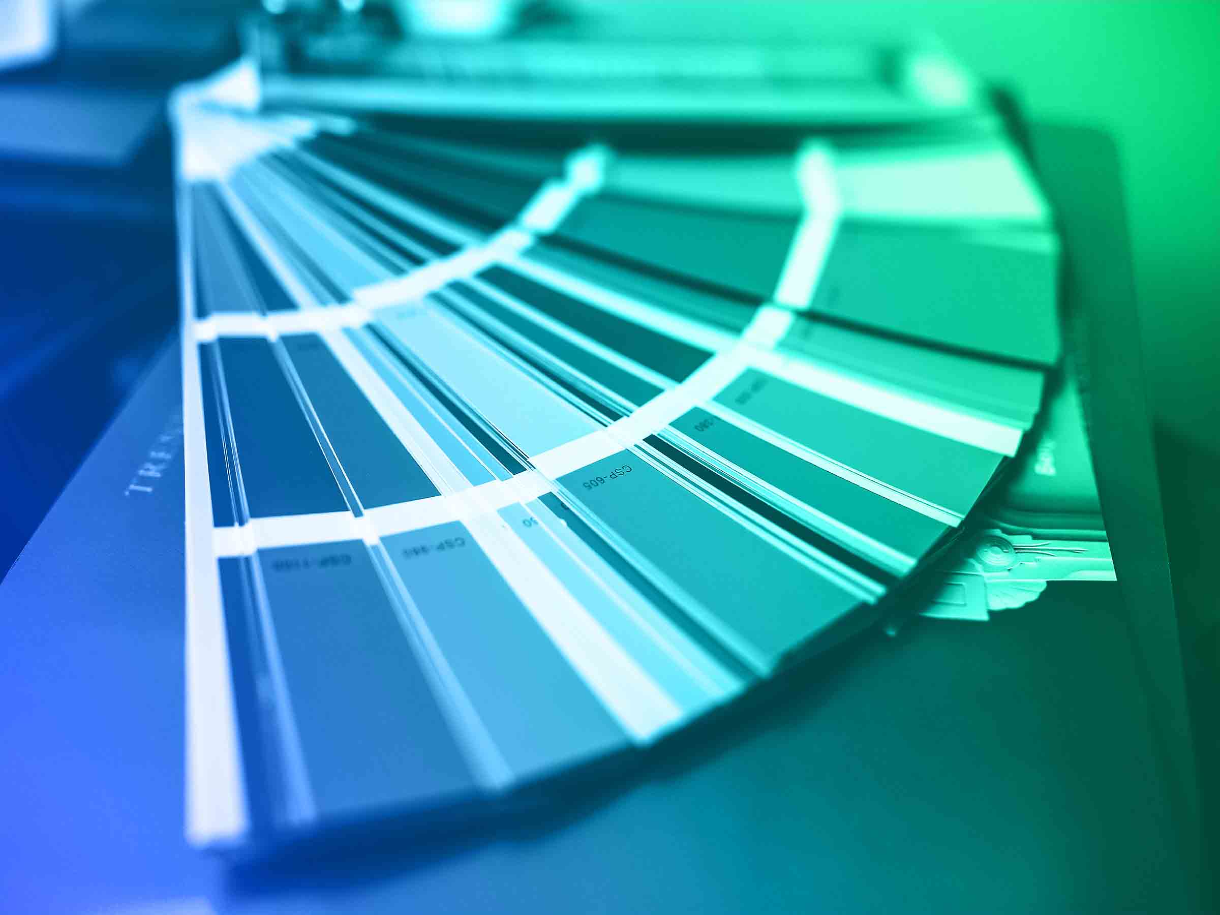
Every December, Pantone releases their color of the year. Pantone is the authority and leader in color worldwide. If you have been to your local hardware store or ever tried to buy or match paint. You’ve probably seen a small color guide or book that looks a little something like this:

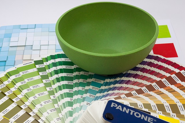
That is a color guide created by Pantone that helps you match any color. Makes it possible for producers and designers to make sure they are looking at the same color across the world if they are working together. Let’s say your company designs clothes and you want your shirts a specific color. You would tell the producer in India, Italy, or Los Angels that you want the Pantone color of the year Greenery and give them a code like RGB (red, green, blue) 136, 176, 75.
The producer on the other side of the world would pull out their Pantone color guide and be looking at the exact same colors. However, in regards to custom poster printing this doesn’t work and becomes more complicated. Because the printing industry uses CMYK colors which have a lower color spectrum than RGB colors. As a result, not all RGB colors can be matched. We will show later on in this article how you can overcome this issue.
So what does the Pantone Color Of The Year have to do with me?
So what does it mean that color experts got together and decided on the color of the year? What does that mean for me as a designer? What does it mean for small businesses? and What does it mean for me as a consumer? It means that this year we are going to see this color a lot in fashion, in interior design, and in popular culture in general. Don’t believe me? Check out a list of their previous Colors of the Year. See if they seem familiar to you by year. The Color of the Year is a prediction by color experts about where color is going for the year, it isn’t just a decision by some to say that X color should be used.
2017’s Color of the year: Greenery

“Greenery” is 2017’s Color of the Year. This shade of green is not your typical green and it has a lot of yellow in it. Although there are similar greens in grass and leaves, this is a very specific green. Pantone describes Greenery as a “fresh and zesty yellow-green shade that evokes the first days of spring when nature greens revive, restore and renew.” Since the year 2000, the Pantone Color Institute organizes meetings with the world’s leading color experts to decide on the Color of the Year. These experts come from the textile, design, fashion, and other fields to discuss where the world is and what they see as the coming trend for the next year.
The team of color experts spend their time looking at trends in society, technology, and design and look for indicators. That describe where color is right now and what direction people wish to move. So greenery can be seen as a hopeful color right as a winter is ending indicating that there is new growth in the world in 2017. Leatrice Eiseman, Executive Director of The Pantone Color Institute describes it as “Greenery bursts forth in 2017 to provide us with the reassurance we yearn for amid a tumultuous social and political environment. Satisfying our growing desire to rejuvenate and revitalize. Greenery symbolizes the reconnection we seek with nature, one another and a larger purpose.” Often, the selection for color of the year becomes a very popular and mainstream color in the years following the decision.
How to use Greenery
You’ve probably begun to see this color as it’s grown in popularity in 2017. One of the first steps we can do as designers and consumers is to look at this and jot down some ideas about what does this color make us think about. What is the historical context for the color, what emotions it evokes and what kind of products it would be associated with. There’s a life to the color, it evokes new growth and freshness.
As we stated before, it’s important to mention that printing companies mostly use CMYK color codes. Which actually can’t print the exact Pantone color codes as there usually isn’t a perfect matching code in CMYK. However, if you don’t mind using a close 99% match that will be barely visible to be different anyway, you can simply use the CMYK codes provided by Pantone and save a lot of money on your printing project. For instance, the 2017 color Greenery in CMYK is: C54 M0 Y100 K0. Moreover, if you’re wondering what the HTML code for Greenery would be, it’s: 88B04B.
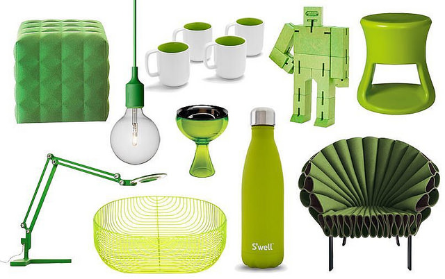
Where do we see it already?
We are already seeing the Greenery color in consumer products and design in 2017. Below are a few examples of Greenery in the real world.

Previous colors of the year
Feel free to check out some of Pantone’s previous colors of the year for some inspiration as well. They might not be as popular in 2017 as they were five or six years ago. But there is a lot that businesses can draw from them to incorporate into designs. This years Greenery evokes new growth and a feeling of connectedness to nature. But maybe your company is about security or your services are about long term reliability; previous colors of the year can be a good starting point to look at if you are tired of using traditional blues and reds.
Because these colors are standards and reference colors.You can be sure that when speaking with a printer or producer and you give them a reference code, they can match it to suit your ideas. Let’s say you are making a poster campaign with lots of blues and pinks. Instead of using a traditional pink or simple blue, Pantone had two colors of the year in 2016, “rose quartz” and “serenity”. Commonly you can use these two colors for consumer products

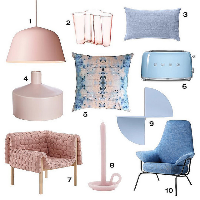
These were the colors of the year in 2016 and you’ve probably seen them around in your own life. Instead of just a traditional pink and blue, these colors transmit a mindfulness and security for viewers where other shades don’t match up.
In 2015, the Pantone color of the year was Marsala:

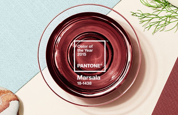
This deep red gave inspiration to fashion, interior designing, and poster printing and became a widely pervasive color in popular culture. Now is accepted as a normal everyday color after the color experts were able to identify its potential.
Pantone does not license or sell any colors directly linked to their color selections for color of the year. They are merely trying to identify trends. Because of this, as poster designers we have an authority who studies which colors will have an impact in popular culture every year. It’s a free tool for designers and advertisers to maximize their connection with the public. And jump on trends before they become too mainstream. Use and embrace the colors of the year.
Conclusion
For your coming design, whether it be for textiles, posters, flyers, or stickers it’s a good idea to use Pantone. As a resource for color inspiration. They’ve successfully identified trends and popular colors in recent years and those colors can help your posters use popular and trendy colors instead of just the traditional ones.
Using “greenery” instead of a regular light green is trendy. It’s a color that is gaining in popularity and transmits something different than a normal light green. “Rose quartz” and “serenity” go beyond just a traditional pink and blue that most would use and give your posters a pink and blue. That balance each other out while bringing order and peace to the viewer. As designers, it’s up to us not to just create an attractive image for the viewer. But to also give them colors that reinforce our message and our brand.