Don’t underestimate the power of print. Well-designed printed materials enable businesses to connect with customers in a very physical way. Print can give businesses an advantage in the digital age. Whether you’re an experienced print designer or beginning your first print design project, there are some key points to remember. Read on, and take note to avoid these common mistakes for your next print-perfect design.
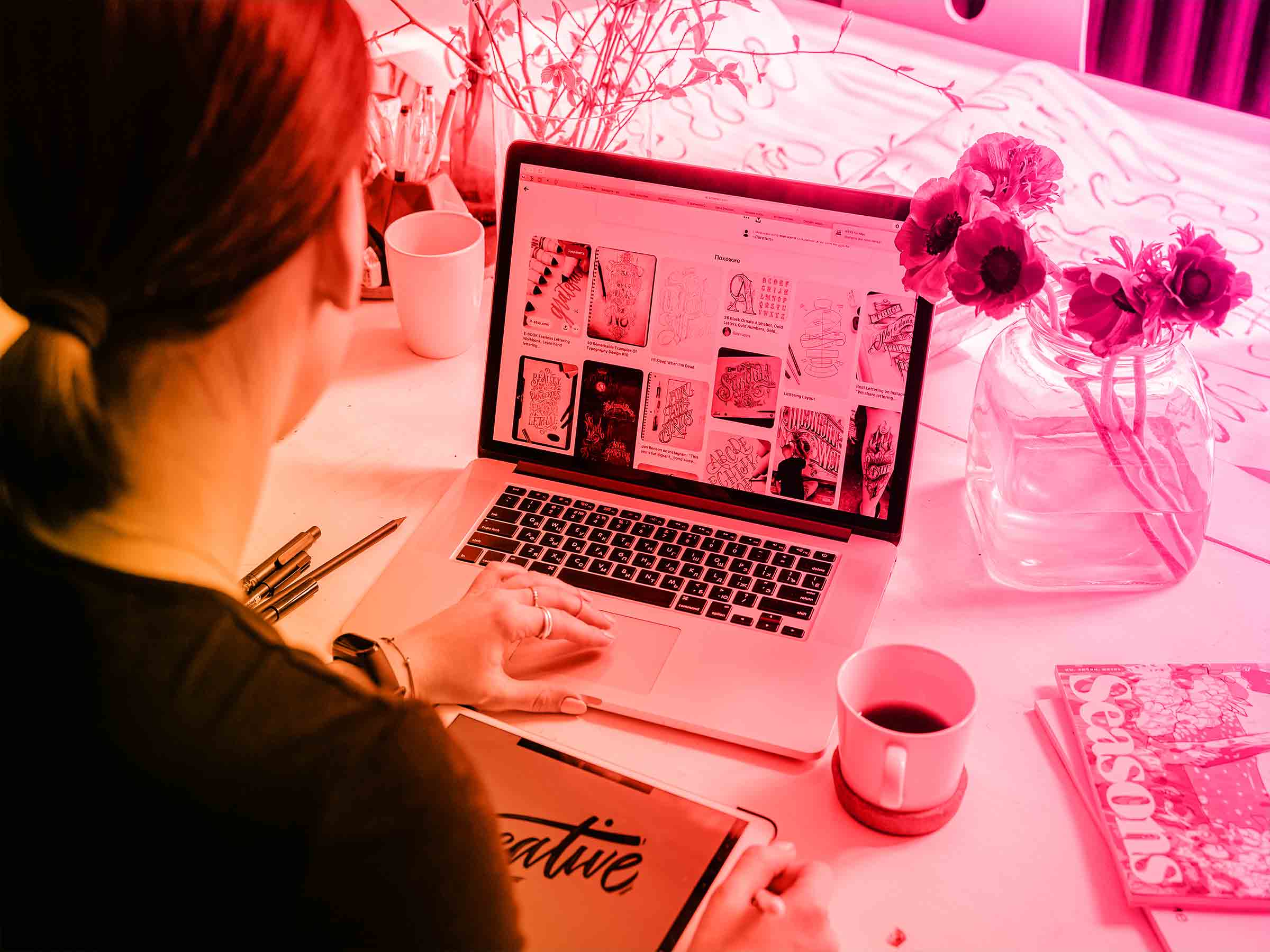
An investment in reputable design software is always going to be worth it. Whether you’re investing in the tool itself or investing time into becoming a pro with your chosen program, don’t skip this point.
The most popular design programs include Adobe Photoshop, InDesign and Illustrator. While costly, they equip you with everything you need to create beautiful designs for print. There are many free graphic design tools that deserve a place among their more expensive competition.
If you’re looking for a free, multi-purpose Adobe substitute, GIMP is a great option. It’s perfect for editing and retouching images, free-form drawing and converting between different image formats.
Whatever your choice, spend time learning from the user guides and tutorials for the product you’re going to use. This will save both time and mistakes when you begin your design.

There is nothing better to distract your customers from your key messages than to use every color in the rainbow on your printed materials. Set a color palette that includes or compliments your brand colors. Then stick to them, and use them sparingly.
Think about how you can use the fewest colors to make the biggest impact. Simple designs that include clever spacing and strong typography don’t need to have too many different colors. Play by the common rule of thumb that less is definitely more.
Resist the urge to add an image, icon or other design elements to every available space in your design. Minimalist brands like Apple use white space beautifully to create simple, yet powerful printed designs.
Empty space can be used to create a clean, professional look and feel of your printed design. Used correctly, it can make your key message or call to action unmissable and easier to digest.
Don’t presume that your printer is going to have an immense gathering of fonts, particularly the more unique ones in your library. Make sure to install your text styles specifically into the record that you are printing.
It’s important to avoid text style substitutions which can happen when the printer does not have your exact font available. There is an unmistakable contrast between Garamond, Bookman, Courier and Times. Spend time incorporating your thoughtfully-chosen fonts into the design.
It’s easy to forget the paper that your work will be printed on after spending hours perfecting your design with your favorite software. Using a full-bleed colored background, for example, may look beautiful on the screen, but could be a challenge to print. Depending on the printing method and material used, certain colors may be either difficult or impossible to replicate.
Using colored paper or material could be an option. Providing your colors perfectly fit your color palette, colored paper could make your life a lot easier.
Consider the texture of the paper or material too, which could add extra depth or texture to the final product. This is something that you can’t replicate on your computer screen.
One of the most common errors when designing for print is not using high-resolution or vector assets. Looking at a low-resolution design or image on the screen might not look too bad, but printing is another story.
Make sure your print resolution is perfect, especially if you source any images online. There is nothing worse than seeing beautiful designs that have been printed from low-resolution files. Before you send your final design for print, make sure every element is high-res to ensure a perfect finished print.
Keep in mind any bleed areas for anything that needs to be trimmed down or displayed in a certain way. If you’re working on a backdrop for a conference, you may need to supply your printer with a file which is a little larger to allow space for the extra material which fits around the supporting frame. The standard bleed size is usually 0.125”, but it may vary depending on the printer and final product.
It’s a designer’s worst nightmare. You’ve sent your last bit of work off and had it printed up, just for the customer to let you know their phone number on the poster was inaccurate.
A reputation for mistakes is the most harmful thing for a designer in the long run. It is fundamental that you permit yourself the time to verify your content for any typographical, accentuation and linguistic mistakes.
Keep in mind that a lost comma can drastically change the significance of a sentence, or a missing period or hyphen in an email address can make it impossible for potential clients to contact you.
Combining print with digital allows you to get the best of both worlds. Print marketing materials will allow you to reach a new audience and by adding your social media handles to your print designs, you can make sure you get real followers for your business in the digital world too.
Harold is a marketing enthusiast and an influencer in different verticals. She keeps a special interest in the impact of visual branding on business growth. She has been writing for a long time now and has an interest in traveling as well.


